On Jan. 8, 2021, Chicago Fire FC announced that the team would design a new crest that was designed by Chicagoans, for Chicagoans.
After rebranding in 2019, the Fire looked to supporters to help create a crest designed with the city’s interest in mind. Led by esteemed designer Matthew Wolff, the Fire gave full creative control to Wolff, supporters, and professional football fans worldwide on the new look of the Club.
After months of roundtables, website submissions, surveys and social media responses, the Club had a good idea of what the people wanted.
Meanwhile, behind the scenes, the Club was quietly laying the groundwork for the return of a color that was beloved by all those familiar with the Fire’s history.
With the team wearing navy kits, the Club knew that the earliest they could officially ‘return to red’ would be in 2024, due to the manufacturing from uniform suppliers.
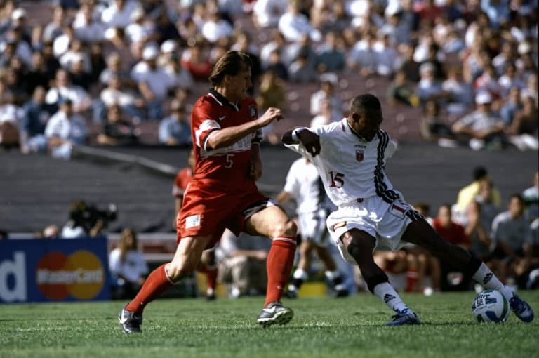
With that in mind, Chicago Fire FC’s creative team sat down and drew inspiration from legendary kits in the team’s history, including that of the 1998 Double-winning team, adding a modern twist, with baby blue components from the Chicago flag.

But with years until the kit’s announcement, the Club took its time to get it done. More importantly, they took their time to get it done right.
Six months after the initial announcement of a new identity incoming, the first domino fell. The Fire formally introduced their new logo. A circular logo with the second star of the Chicago flag in the middle of a ‘C’ and a nod to the old Florian crest of 1998. The Fire had their look.
It was a logo that captured the essence of the Chicago Fire.
But it was also a logo that was designed with red in mind.
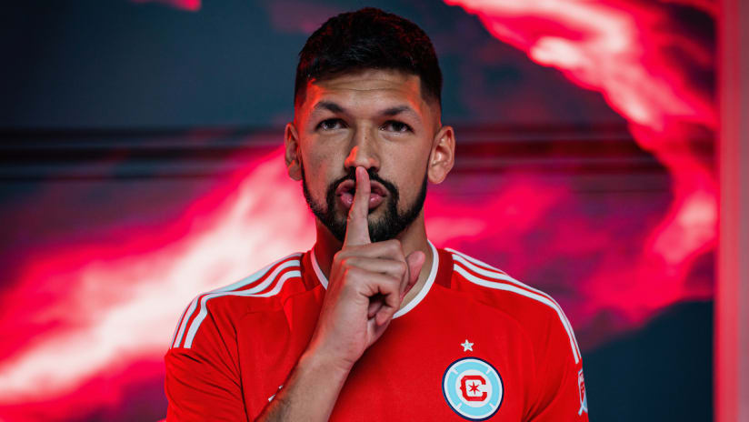
On Feb. 15, the Fire returned to red (officially). At an event hosted at Moonlight Studios, the Club unveiled their highly anticipated kit to hundreds of supporters and partners. An awe-inspiring video voiced by Fire alumni and English radio analyst Dasan Robinson, the presentation flooded the room with a sense of pride and optimism.
It truly was, as Robinson states in the video, “A legacy reborn”.
The official shade of red on the base of the kit is named “Fire Red” and is very reminiscent of the red seen on the Fire kits from 2016-2019.
What really sets this kit apart from those in the past are the finer details that most might not catch at an initial glance.
Embedded into the seams of the kit are red Chicago stars, and “Por Siempre Rojo” is written on the collar, translating to “Forever Red” in Spanish.
The players had worn them days prior at the team’s annual Media Day but were sworn to secrecy so fans could enjoy their moment in the coming days. At the time of the announcement, the team was in Coachella Valley for preseason camp.
But once the kits were unveiled, players eagerly shared their pictures, boasting their approval of the Fire’s signature look.
After a 2-2 draw against the Philadelphia Union in the season opener last weekend on the road, the attention finally shifts to the lakefront.
Saturday night’s home opener sees the Fire host reigning Supporters’ Shield winners FC Cincinnati under the bright lights of Soldier Field.
It will also mark the first time since Sept. 29, 2019, that the Fire wear red kits on home soil. Additionally, it’s also the first time since Oct. 21, 2005, that the Club sports red at Soldier Field.
18 years, four months, and 12 days later, for a grand total of 6,709 days, that streak ends on March 2.
While the focus for the Men in Red is three important points, the moment hasn’t escaped Homegrown midfielder/defender Mauricio Pineda, who knows what red means to the City of Chicago.
“Ever since I joined the Club, I was wearing a red jersey,” says Pineda, who spent years as a member of the Chicago Fire Academy. “It's exciting to be back in red, back in the color that we were always used to playing in the Academy. We're excited for that, and even better that it's at home.”
There’s no generational gap between Chicago Fire FC and the color red.
For Head Coach Frank Klopas, who was notably a member of the 1998 team that won the Double, he couldn’t help but give the media a thumbs up and a smile when asked about the team’s attire this weekend.
“For me, I love the red,” said Klopas. “That's the Fire for me. I think it just reminds me, [and brings me] back to the old days, of the beginnings where this organization started.
“It's just really powerful when you put that jersey on. The players, when they saw it and put it on, they were very excited because it's just a great color, it's a great jersey, and obviously it's good to have that back. And I think our fans will be excited, also.”
Excited indeed.
When the Fire finally announced their ‘Return to Red’ kits, the fanbase couldn’t have been happier.
It ushers in a new era of Chicago Fire FC, led by proven veterans like recent signings Kellyn Acosta and Hugo Cuypers, and the promising potential of Homegrowns like midfielder Brian Gutiérrez, goalkeeper Chris Brady, and the aforementioned Pineda.
“I think the red is an important part of the Club's history,” Pineda said. “For me, for all the guys that have been around the Club for a while, we know that.”
“So, we're going to take that into account when we're wearing the red and really trying to represent the right way,” added Pineda. “That goes for everyone and the rest of the team. I think everyone's excited for the red and we know the history that this Club has in that color.”


